Yosemite X.X
Yosemite has been released for over a month and already had a minor update. It was already pretty stable before the update, which is pretty impressive considering all the changes and new features added. I think one contributing factor is the re-introduction of the public betas, where less developer-centric users were able to help squash bugs that may not have been found by developers who were busy fixing their own bugs.
Even with the slew of new features, I like to think of Yosemite as an iterative change to Mac OS because there just isn’t one single feature that truly stands out for me. One reason is simply because the OS is already very capable and mature. Handoff felt like a natural progression to the OS: Apple makes iOS devices, so of course we can improve the experience (and sales) if they worked together. Similarly, it made sense for Apple to extend the AirDrop feature to work with iOS. Instead of revolutionary features, Yosemite brought features that made it easier to do what was already possible. Yes, there’s also the fresh window of paint (glass trash can anyone?), as well as probably hundreds of little small tweaks and improvements.
Further improvements
Yosemite and iOS 8.1 were both major updates and released within days of each other. Apple engineers have put in a great deal of effort into this release and it seemed like there was a strong sense of collaboration between the Mac and iOS teams. This is great in many ways. First, it strongly suggests that they will focus on quicker release cycles. It is often better to ship few new features, but on a regular interval rather than one huge release where it is much more likely that users will encounter edge cases that slip through testing. It also means less code to update at once (think iOS 8 update weighing in at 5GB).
Another potential benefit is that this collaboration will encourage new ideas and constant learning from each side. A great example1 is how trackpad accuracy improved drastically after Apple came out with the iPhone because they learned so much from designing and implementing a responsive and precise touchscreen.
New software will always have bugs and there is no point in talking about those. However, there are several areas where the usability can be improved, especially in Spotlight, multiple displays, and Calculator.
Spotlight
One big change with Yosemite is the “enhancement” of Spotlight. Previously, the primary use included launching apps, finding documents, built-in calculator, and defining words. With Yosemite, you can now search for nearby restaurants, movies, etc. Apple also promises that these search queries will be anonymous and aggregated to increase the level of privacy.
What I don’t like about the Spotlight is that it takes up so much room, and, because it is centred in the screen, it blocks most of the top-running application. I mainly use Spotlight’s calculator functionality, but oftentimes I have to memorize my equation or enter it in chunks because my application is hidden (hint: don’t press esc).
Spotlight can be more smart about this. Back in previous versions, when it detected that you were using the calculator feature, it would minimize the menu to only show the result of the calculation. Similarly, Spotlight in Yosemite can minimize and just show a one-liner answer.
One reason behind centring Spotlight is to encourage users to use it as a one-stop shop to find information, documents, movies, etc. I can also see it as a Siri equivalence for the Mac. Siri can be quite convenient to use hands-free (when it is online), but we can often save more time by typing in our query using the keyboard. Under this assumption, Spotlight is a distinguishing feature that locks in customers.
It also can be useful as a marketing demo. Imagine TV ads showing off how easy it is to find the information that you need (albeit only specific kinds) from anywhere without any delay. I’m sure there will be users who will find this useful, but I don’t I’m one of them. It’s good that there is the option to selectively turn off these features because there’s no need for me to use them when I am already familiar with methods to get the information that I need.
The first version of a product (or a redesign) usually is never the finished product. There are a lot of areas that Spotlight can improved. For example, it may be useful to dock the Spotlight so that it will always show up in the top right corner of the screen. This reduces the chances that it will cover up any information that might be shown on the active application. Another addition is to provide a shortcut key for each of the suggestions. This would be useful for keyboard shortcut enthusiasts. Unfortunately these power-user features will probably never ship (prove me wrong Apple :P).
Multiple displays
I recently got a second monitor and it is fantastic. The extra screen estate allows me to display more of the information I need and reduces the number of cmd-tabs needed. Multiple display support is obviously not a new feature of Yosemite and I did not have any experience with external displays before installing Yosemite so I’m not sure what changes (if any) have been made. Nonetheless, there are a great deal of improvements that I can think of.
There’s some crazy things happening with fullscreen transitions. When iTunes is open on my external monitor and I play a movie, that movie shows up fullscreen on my MacBook. Of course, the logical thing to do is to play it on the screen that iTunes is open…
One annoying new “feature” is that the green traffic light button on every window now defaults to fullscreen-mode, instead of maximizing the window. I know there might be people who might want that as the default option, but it would be nice to have a checkbox option in Preferences to revert back to original functionality. One more thing is that the “maximize” button doesn’t always resize the window to fit the entire screen. Depending on the use case, some applications should take up the entire screen (but still show the Mac menubar), like XCode or Sublime Text, or Preview. However oftentimes they only resize to the maximum size of the displayed content. Or worse, there is this small gap where the Dock is hidden.
The Mac menubar will be dimmed on the display that is not in focus. I can understand that this is used to distinguish which screen one is currently focused on. However this costs more usability than the gains. External monitor s increase the peripheral area that our eyes need to see, which takes more effort to look at the outside edges of the screens. This means that it, if the external display is setup to the right of the MacBook, the easiest way to look at the time is to stare directly forward, where you will see the top right corner of your MacBook (the clock on the other monitor is on the edge of your peripheral vision). Now if an application on the external display is active, the menubar on the MacBook will be dimmed and this makes it extremely difficult to read. I realize that this is a very small inconvenience, but these just gnaw at you because it doesn’t make sense for Apple not to change it.

Calculator
With Yosemite, Apple redesigned the Calculator app and added a calculator extension in Notification Center. I don’t see the point of including a basic calculator extension, other than the times when you need a quick calculation and Spotlight blocks some information that you need.
First, lets talk about the redesigned Calculator app that looks very similar to the one on iOS. I say very similar because there is one key difference in the UI:
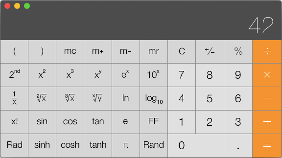
Notice that in the general square root button, the positions of the variables x and y are reversed. I was used to the order of operations on iOS and was surprised when I got an unexpected answer on the Mac. The convention with using x and y symbols on calculators is that x should be the first variable entered. I really hope they change this (little) discrepancy.
Pressing the letter ‘c’ on the keyboard should clear the display, but the C/AC button never turns into “AC”. Finally, I think that the calculator app should not show the resize cursor since one can only change the size of the window by changing the calculator mode.
Summary
Apple is known for their extraordinary attention to detail. I think that this task is a lot easier when the product is physical because there are only so many edge cases to consider. But in the software world, there are a million ways that something can go wrong (however unlikely), and with millions of customers, one of them will probably find it. The ultimate question is whether Apple wants to add new features or make their existing ones solid. I hope that with this new iterative and rapid release cycle they will be able to push out more fixes in the same amount of time.
1. Listen to the excellent 2-part series "Understanding Apple" with Don Melton and Nitin Ganatra on the Debug Podcast.
Freedom of the Bike
There’s nothing quite like riding a bike: it just feels like a natural extension of my body. When I bike, I’m almost always standing up. Being able to swing my arms to gain speed makes me fast and nimble. Especially with the wind blowing in my face.
Time flies by
I can get between any two places on Waterloo campus within 5 minutes. From Waterloo to Laurier campus? About 10 minutes. There’s nothing better than sleeping an extra couple minutes knowing that’s how much time I’ll save by biking. Plus, biking can really wake me up.
And it got stolen
In the wee hours of Oct 1st someone stole my bike, leaving nothing but my cut lock. This was something I never expected. I’ve seen how other bikes get vandalized. How the front wheel goes missing, or only the frame remains secured to a bike rack. But I thought those were just abandoned bikes. Bikes that were left by their owners, waiting to be stolen from. Why would something happen to my bike?
Back when I still had my bike, I didn’t think too much of it. I got it in grade 10 when I outgrew my smaller bike. The front and rear suspension wasn’t as good, but switching from a front caliper lever to disc brakes was just amazing. The stopping power was incredible. I pretty much used only my front disc brake.1</li>
The bike being 5 years old, it had been through a lot but it was still in pretty good condition. I popped the back tires twice. I also managed to break the rear wheel axle (the plastic package that kept the ball bearings evenly distributed aroud the axle had broken, and the axle snapped). My dad had helped me salvage my other bike’s rear axle (bike cannibal?). The trick to keeping a bike in good shape is really just regular maintainance (and my dad was really good at that).
Thinking of my bike now makes me treasure my bike more than ever. Even though it wasn’t some professional mountain bike, it still meant a lot to me. Did I mention the bike was orange and black?
The lock
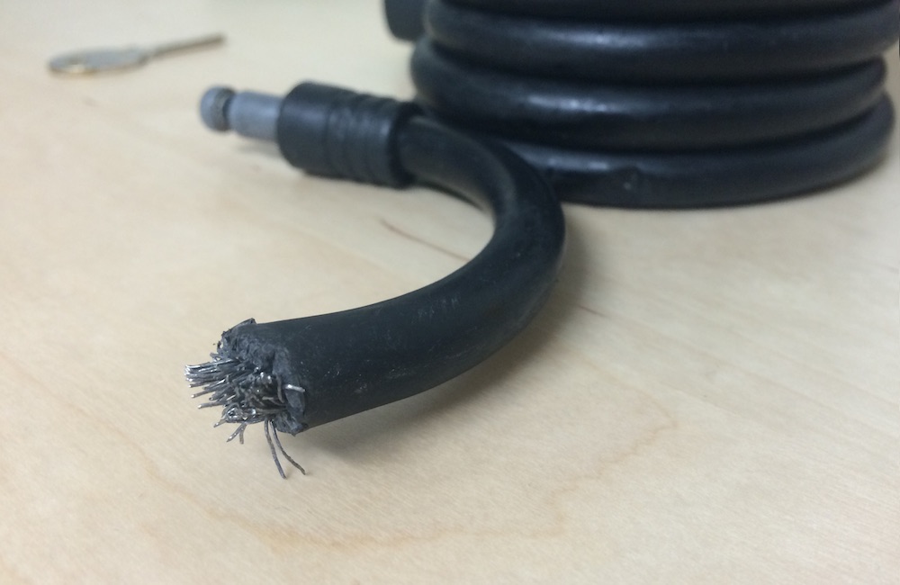
Yeah, the lock doesn’t seem that secure now that I can see how thin the metal wires really are. The hard surrounding plastic actually feels comparable to the wires.
Well, lesson learned: invest in a good bike lock.
1. The back brake was literally useless for the last two years.
Programming in Objective-C
Whenever I see Target…
Facebook Hackathon 2014
More than 300 people crowded the SLC at the University of Waterloo on Jan 24 during Facebook’s annual Hackathon. This was my first one and it was a blast. There were many prizes to be won (not saying I did) and lots of free food (nothing fancy). But the most amazing thing was the atmosphere. I remembered it as probably the first time I was able to talk code with someone else. The experience was a great one and I learned so many new things. So what was it like?
Hello World
This was the first hackathon for all four of us and none of us had any definitive ideas. Some team members had experience on Android (which I had none) while I have experience with iOS and web (which they had none). We began demoing our previous projects to get a sense of the experience of each other. And then began the idea generation…
We finally decided on a multiplyer game which displayed the game on the computer and players could control their characters using their own phones, which was matched to the game using a unique id. The game concept was similar to Light Bikes in Tron. I thought it was something we could pull off in 24 hours as I had worked on a previous project using similar technology (although that was over the course of a month). We took the challenge on and began running.
Up all night to get lucky…
A few things happened: I went to get my computer gear, we finished two bottles of Gatorade, and no one slept. (We did not consume any Awake chocolate.)
The morning code
Now the rush to finish was on. The routine was simple: code->coffee->code.
Lunch
By this time, we got into the groove (finally). We added the finishing polish (no spit was used) to our app. If we were to plot our progress over time, it would be a hockey stick.
The final product
Check it out here:
![]()
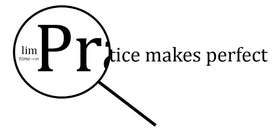
Practice Makes Perfect
There’s something they forgot to mention.